You are currently browsing the tag archive for the ‘interior decorating ideas’ tag.
i must confess, i am not inherently, nor have i ever been a floral kind of gal. i was not aware of this until years ago a really good friend of mine made a dress for my birthday. i was so touched by her thoughtfulness and her talent; however, my first thought was…i never wear cloths with a floral pattern, how am i going to wear this?! it just went against everything that i stood for (o-ka, a little over the top but blame it on my youth)
well, months pass and she finally asked me if i ever wore the dress. i had to confess that i had not. when i told her that i never wear floral patterns, she said that’s e-x-a-c-t-l-t-y why she made it for me. we had to laugh.
now i find myself with several floral designs in my wardrobe. most of them have a funky little twist to them but nevertheless they are floral. i also find myself presenting versions of floral patterns to my interior design clients that ordinarily say don’t show me anything with flowers in it. and more other than not, they surprise themselves when they fall in love with the piece.
moral to this story – don’t knock it til you try it. embrace the girly side of you. take liberty to tweak the style to a modern fun version or go all out country style with flowers in full bloom color if you dare.
here are some new improved floral designs in area rugs from Company C. the designs are fabulous! what a bold statement to be made in any room.

Oversized chrysanthemums
most of their rugs are 100% wool, tufted and natural. if you want to play up the fun factor use these vibrant graphic designs.

A floral rug inspired by an early 20th century Mexican embroidery
i noticed the same fun off beat floral pattern targets zinnia square dinner ware . i love love love this design. i so want to use the dinner plates as a decorative wall motif for a client. i’m just waiting for the right application.

it kind of has that vintage anthropology vibe going on, don’t you think?

anthropology cook ware
the colors are so vibrant, festive and energetic. they remind me of mexico. by the way, my next post will feature Rosalia, a dear friend and local artist in the charlotte area. i can’t wait to show you images of her home, which is a celebration of all the colors found in her home country, mexico.

and the beat goes on for the design project i mentioned in an earlier post “bare naked walls” .
the painting is complete. still a very neutral color by pratt and lambert that warms the room, adds a hint of color and satisfies the husbands love of neutral tones. the wife conceded. her affinity to color will be realized in the furnishings and art.
also in the image below, the wallpaper within the custom molding has been installed. it’s a textural combination of green, gray and blue. again neutral but warm. drapes to follow shortly will pick up the grayish blue tones.

as with all grass cloth papers, the seam is apparent. the lighter color in the middle is also a natural variation you will find in this material. shopping for the wallpaper on line gave the client a better price break. although a shade off in color it still works with the design plan.
i’m shopping for accessories and furniture this week. so i should have a post in about two weeks for ya. as my two and a half year old niece says, “i love it” when a plan comes together! it’s going to be fabulous!
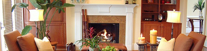
this is a quick fix, architectural detail, that resolves the problem of bare naked expansive walls, common in 2 story family rooms.
it’s common in new homes (at least in the southeast) to have an open floor plan where the kitchen and the family room open as one unit. it’s also common to have the foyer, dining room and study/living room spill into this same area. this type of floor plan is a big selling point for buyers; however, once they are living in the space they are floored (tee-hee! get it?). they have no idea how to dress, uh-hum, address those bare walls. (don’t worry, i won’t quit my day job)
case in point. my clients, the Robinsons (names have been changed to protect the innocent), needed to fill up two massive walls at 17′ high and make it flow with the rest of the house. our focus in this writing is on the fireplace wall.
as you see for the sketch below, i decide to extend the existing trim (or molding if you prefer) features of the bookcases up 5′ and over the fireplace; thus creating one complete unit. the idea is too make it look like it was built-in with the original plan and not an add on.

what a beautiful, uncomplicated, simple, no frills idea! and my clients loved it!
if you are handy with wood working or basic carpentry skills and you have the right tools then you can easily cut and install the trim yourself (i know, easy for me to say). the client hired Shy’s Design and Construction company to do this job. primed wood was spec’d since the trim will be painted white to match the existing trim.

inside the trim and on the back of the bookcase walls we will hang a beautiful neutral tone grass cloth with a hint of blue to give it that wow factor and it will also tie in similar colors that we’ll put in the dining room.
there’s lots more going on with this client so i’ll share pics as the projects progresses. so, don’t be shy (oops, i did it again) about adding molding and trim features in your home to solve your interior design dilemmas.
Shy’s Construction Erik Scheidegger 704-502-1191
the console i used for this project was fine in its original condition. it was just all wrong for my purpose. the space needed an injection of color and i wanted an old weathered looking piece.

console in its original condition
i spotted it at a local consignment shop. i didn’t really notice it until the second time around. the dimensions and price were perfect. it just needed a makeover which resulted in a fabulous very custom looking piece of painted furniture.
E+O’s step by step from blah to beautiful:
1- lightly sand the entire console
2- primed it randomly so the crackle texture and original finish peeped through
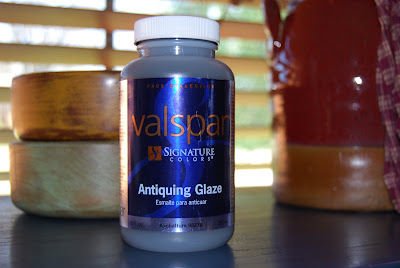
3- 3 colors of paint were applied using equal parts of acrylic paint, water and glaze. it was important for all the colors to show. the darker color, indigo blue was applied first. random fluid strokes were used. the creamy color was second and the prominent color, periwinkle was applied last.
4- highlighted areas of excessive wear and tear (in edges, near the drawer pulls) received a concentration of dark umber antiquing glaze while all other areas received a very light coat. after it was applied i used a soft white rag to wipe it off. make sure the rag does not release loose fibers that will remain on the furniture.
5- in some areas i used a badger brush to distribute and remove the glaze. (to do this i dabbed a foam brush with glaze in certain areas and used the the badger brush to spread it over the area. after a few strokes i removed excess glaze from the brush with a rag. i repeated this process until the glaze was uniformed)
6- along the edges of the table top i used my fingertips to rub on metallic antigue gold rub and buff i purchased on-line from dickblick.com. (these are handy to keep around for toning down bright metals and to add a depth of richness to almost any home decor item) . using your fingertip gives you more control.
7- i switched out drawer pulls to coordinate with the new look
8- the last step was to apply 3 coats of varnish

Distressed console after the makeover using acrylic and metallic paints

Post Comments