You are currently browsing the tag archive for the ‘Interior Design Color’ tag.
and the beat goes on for the design project i mentioned in an earlier post “bare naked walls” .
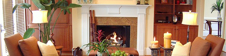
the painting is complete. still a very neutral color by pratt and lambert that warms the room, adds a hint of color and satisfies the husbands love of neutral tones. the wife conceded. her affinity to color will be realized in the furnishings and art.
also in the image below, the wallpaper within the custom molding has been installed. it’s a textural combination of green, gray and blue. again neutral but warm. drapes to follow shortly will pick up the grayish blue tones.

as with all grass cloth papers, the seam is apparent. the lighter color in the middle is also a natural variation you will find in this material. shopping for the wallpaper on line gave the client a better price break. although a shade off in color it still works with the design plan.
i’m shopping for accessories and furniture this week. so i should have a post in about two weeks for ya. as my two and a half year old niece says, “i love it” when a plan comes together! it’s going to be fabulous!
the console i used for this project was fine in its original condition. it was just all wrong for my purpose. the space needed an injection of color and i wanted an old weathered looking piece.

console in its original condition
i spotted it at a local consignment shop. i didn’t really notice it until the second time around. the dimensions and price were perfect. it just needed a makeover which resulted in a fabulous very custom looking piece of painted furniture.
E+O’s step by step from blah to beautiful:
1- lightly sand the entire console
2- primed it randomly so the crackle texture and original finish peeped through
3- 3 colors of paint were applied using equal parts of acrylic paint, water and glaze. it was important for all the colors to show. the darker color, indigo blue was applied first. random fluid strokes were used. the creamy color was second and the prominent color, periwinkle was applied last.
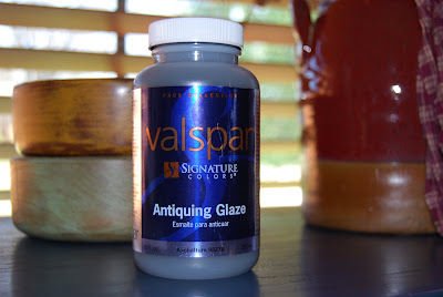
4- highlighted areas of excessive wear and tear (in edges, near the drawer pulls) received a concentration of dark umber antiquing glaze while all other areas received a very light coat. after it was applied i used a soft white rag to wipe it off. make sure the rag does not release loose fibers that will remain on the furniture.
5- in some areas i used a badger brush to distribute and remove the glaze. (to do this i dabbed a foam brush with glaze in certain areas and used the the badger brush to spread it over the area. after a few strokes i removed excess glaze from the brush with a rag. i repeated this process until the glaze was uniformed)
6- along the edges of the table top i used my fingertips to rub on metallic antigue gold rub and buff i purchased on-line from dickblick.com. (these are handy to keep around for toning down bright metals and to add a depth of richness to almost any home decor item) . using your fingertip gives you more control.
7- i switched out drawer pulls to coordinate with the new look
8- the last step was to apply 3 coats of varnish

Distressed console after the makeover using acrylic and metallic paints

Post Comments